
Key Takeaways
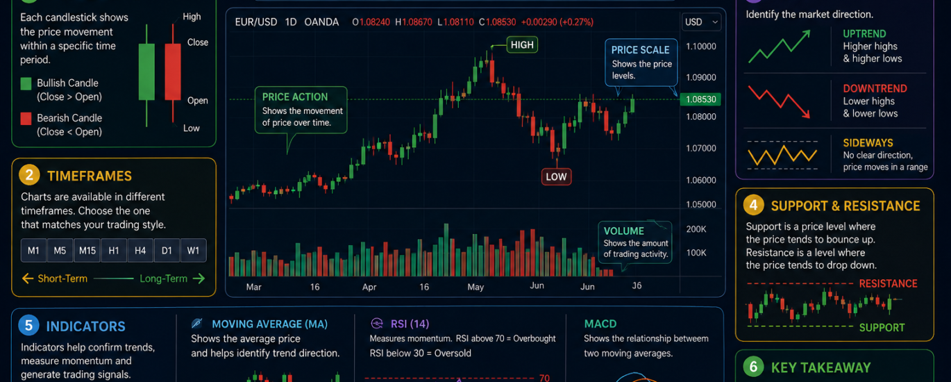
- Mastering the Basics: Learning how to read forex charts is the foundation of technical analysis and profitable trading.
- Chart Dynamics: Line charts show simple trends, bar charts add detail, and candlestick charts provide the deepest market insights.
- Candlestick Power: Knowing how to read forex candlestick charts lets you spot instant shifts in buyer and seller momentum.
- Pattern Recognition: Identifying forex chart patterns like double tops and head and shoulders helps predict future price breakouts.
- Core Tools: Drawing trend lines in forex and finding support and resistance zones are essential for managing trading risk.
- Timeframe Strategy: Combining multiple chart timeframes in forex aligns your daily executions with long-term market trends.
Walking into the world of currency trading without knowing how to read a price chart is like driving through a foreign city at night without a map or GPS. The global currency market moves over $7 trillion every single day. Yet, a staggering 70% to 80% of retail traders lose money in their first year. The primary reason for this high failure rate is not a lack of capital or ambition. It is the inability to accurately interpret price data. If you want to join the profitable minority, learning how to read forex charts is your absolute first step toward success.
Price charts are the heart of currency trading. They convert millions of buy and sell orders into visual stories that show who is winning the battle between buyers and sellers. By mastering forex chart analysis for beginners, you strip away the guesswork and replace it with data-driven logic.
This comprehensive forex trading guide will take you from absolute novice to a confident chart reader. You will learn to differentiate between chart types, identify high-probability patterns, and apply professional technical analysis in forex. Let’s dive in and unlock the visual language of the currency markets.
Understanding the Core Types of Forex Charts
Before you can spot complex patterns or ride major market trends, you must understand the visual formats used to display price data. While modern trading platforms offer dozens of custom views, three foundational types of forex charts dominate the industry. Choosing the right one depends on your trading style, your experience level, and the specific strategy you employ.
Line Charts vs. Candlestick Charts
The choice between a line chart vs candlestick chart comes down to simplicity versus depth of information. A line chart is the simplest format available. It plots a single line connecting the closing prices of a currency pair over a set period.
Traders use line charts to eliminate market noise and get a crystal-clear view of the overall trend direction. However, because it only displays closing prices, it hides the intraday volatility, missing the opening, high, and low prices.
Line Chart:      [Close] -------- [Close] -------- [Close] (Simple Trend)

Candlestick:     [High] -> [Open] -> [Close] -> [Low]   (Full Volatility Details)
In contrast, learning how to read forex candlestick charts gives you the complete story of a trading session. Every single candle displays four critical price points: the Open, High, Low, and Close (OHLC). This extra data helps you see market volatility and shifts in momentum that a line chart completely hides.
The Anatomy of a Bar Chart in Forex
A bar chart in forex serves as the functional bridge between simple line charts and highly visual candlestick charts. Also known as an OHLC chart, a bar chart uses a single vertical line with two small horizontal tabs to represent a specific period of time.
- The Vertical Line: The top represents the highest price reached during the timeframe, while the bottom marks the lowest price.
- The Left Tab: This horizontal notch shows the opening price of the period.
- The Right Tab: This horizontal notch displays the closing price of the period.
If the right tab is higher than the left tab, the price rose, making it a bullish bar. If the right tab sits lower than the left, the price dropped, indicating a bearish bar. Bar charts are excellent for keeping clean data visualization across multiple screens while still tracking daily volatility.
Why Candlesticks Dominate Forex Trading Charts
When you browse modern forex trading charts, you will quickly notice that candlesticks are the industry standard. Originating from 18th-century Japanese rice traders, candlesticks turn raw numerical data into highly actionable visual cues.
The rectangular center of the candle is called the “real body,” showing the distance between the opening and closing prices. The thin lines extending from the top and bottom are the “wicks” or “shadows,” marking the extreme highs and lows.
Candlesticks dominate because they instantly show market psychology. A long real body reveals aggressive buying or selling pressure, while long wicks show that the market rejected a price level. This makes candlesticks the perfect foundation for short-term day trading and long-term swing trading alike.
| Chart Type | Data Displayed | Main Advantage | Best Used For |
| Line Chart | Closing Prices Only | Eliminates market noise; highlights the long-term trend | Quick macro trend identification |
| Bar Chart (OHLC) | Open, High, Low, Close | Clean visual profile; tracks complete price range | Multi-screen systemic analysis |
| Candlestick Chart | Open, High, Low, Close | High-contrast visuals; exposes real-time buyer/seller psychology | Forex price action and pattern trading |
How to Read Forex Candlestick Charts in Detail
To build a strong foundation in forex charts for beginners, you need to know exactly how a single candlestick operates. Every candle tells a story of an ongoing battle between the bulls (buyers who want prices to go up) and the bears (sellers who want prices to go down). By interpreting the color, shape, and size of a candle, you can predict who will win the next round.
    [High]          <- Upper Wick
      |
   +-----+
   |     |          <- Real Body (Distance between Open and Close)
   +-----+
      |
    [Low]           <- Lower Wick
Deconstructing the Candle: Open, High, Low, and Close
Every single candlestick represents a selected block of time, whether it is a 5-minute window or an entire day. The structure relies entirely on four key data points:
- Open Price: The first recorded price at which the currency pair traded when the new candle session started.
- High Price: The absolute highest price peak reached during that specific time block.
- Low Price: The absolute lowest price bottom hit during that same time block.
- Close Price: The final price traded just before the candle expired and a new one formed.
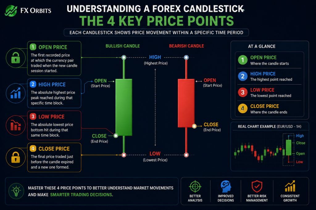
If the closing price finishes above the opening price, you get a bullish candle, usually colored green or white. If the closing price finishes below the opening price, you get a bearish candle, usually colored red or black.
Actionable Tip: Measuring Candle Body-to-Wick Ratios
💡 Actionable Tip: Never look at a candlestick’s color alone. Always compare the size of the real body to the length of its wicks. A large body with very short wicks means one side completely controls the market.
Conversely, a tiny body with long wicks on both ends shows massive indecision. If you see a long wick pointing upward with a tiny body at the bottom, it means buyers tried to push the market up but failed completely, signaling a strong potential downward reversal.
Master Essential Forex Candlestick Patterns
Once you understand single candles, you can start studying forex candlestick patterns. These are distinct combinations of one, two, or three candles that historically predict market direction. Mastering candlestick chart analysis allows you to spot high-probability trade entries right as market momentum shifts.
Single-Candle Reversal Signposts
Single candles can warn you that an existing trend is running out of steam. The two most reliable single-candle formations are the Hammer and the Shooting Star.
  Hammer (Bullish Reversal)       Shooting Star (Bearish Reversal)
         +---+                                  |
         |   |                            +-----------+
         +---+                            | Real Body |
           |                              +-----------+
           | <-- Long Wick
- The Hammer: This pattern forms at the bottom of a downward trend. It features a small real body at the top and a long lower wick that is at least twice the size of the body. It shows that sellers pushed prices down aggressively, but buyers charged back to force the close near the open. This signals a bullish reversal.
- The Shooting Star: This pattern forms at the top of an upward trend. It has a small real body at the bottom and a long upper wick extending upward. This indicates that buyers pushed the market higher, but sellers rejected those high prices, signaling a bearish reversal.
Multi-Candle Confirmation Formations
Multi-candle patterns require more patience but offer stronger structural confirmation. The most popular versions are the Engulfing patterns and the Morning/Evening Stars.
- Bullish Engulfing: A two-candle pattern where a small red candle is followed by a much larger green candle. The body of the second candle completely swallows the body of the first, showing a sharp surge in buying power.
- Bearish Engulfing: The opposite setup, where a small green candle is swallowed by a large red candle, proving sellers have taken full control.
- Morning Star: A three-candle bullish reversal pattern. It starts with a long red candle, followed by a small-bodied gap candle (indecision), and finishes with a large green candle closing well past the midpoint of the first candle.
How to Read Candlestick Patterns in Live Markets
To effectively learn forex chart reading, you must avoid trading patterns in isolation. A bullish engulfing candle appearing in the middle of a messy, sideways market means very little. However, if that same bullish engulfing pattern forms right after a long downward trend hits a historical support zone, its predictive value increases dramatically. Always use patterns to confirm structural locations rather than trading them blindly.
Identifying Core Forex Chart Patterns
Moving out from individual candles brings us to geometric forex chart patterns. These formations develop over days, weeks, or months and reveal large-scale transitions between market accumulation and distribution.
Reversal Patterns: Catching Major Market Shifts
Reversal patterns signal that the prevailing market trend is exhausted and getting ready to head in the opposite direction.
- Head and Shoulders: This classic pattern features three price peaks. The middle peak (head) is the highest, flanked by two lower peaks (shoulders). Connecting the lows forms the “neckline.” A clean break below this neckline indicates a major shift from a bullish trend to a bearish market.
- Double Tops and Double Bottoms: A double top looks like the letter M. It forms when the price attempts to break a high peak twice, fails both times, and drops below the interim low. A double bottom looks like the letter W, showing that the market twice failed to break a low support level and is ready to head upward.
Double Top (M-Pattern):        Double Bottom (W-Pattern):
   Peak 1     Peak 2              Support    Support
    / \         / \                 \   /      \   /
   /   \_______/   \                 \ /________\ /
        Interim Low                     Interim High
Continuation Patterns: Riding the Prevailing Trend
Continuation patterns show that the market is taking a breather before pushing further in its original direction.
- Symmetrical Triangles: These form when price action creates lower highs and higher lows, compressing the trading range into a tight cone. A breakout usually sparks a strong move in the direction of the trend that entered the triangle.
- Bull and Bear Flags: A flag pattern looks like a brief, orderly channel moving against the main trend after a sharp price spike (the flagpole). A breakout past the flag boundary signals that the initial aggressive momentum has returned.
Practical Forex Technical Analysis: Trends and Zones
Visual patterns give you context, but you need structural boundaries to execute trades safely. This is where core forex technical analysis comes into play. By drawing lines across key historical price levels, you create an actionable map for your trades.
How to Properly Draw Trend Lines in Forex
Drawing trend lines in forex is one of the most effective ways to track market direction. A trend line must connect the extreme highs or lows of price action to be valid.
- In an Uptrend: Connect a series of higher lows. The line runs underneath the price action and serves as a dynamic floor.
- In a Downtrend: Connect a series of lower highs. The line runs above the price action and acts as a dynamic ceiling.
🛠️ Real-World Application: A valid trend line requires a minimum of two distinct price touches to be drawn, but it is only considered confirmed once a third touch occurs and holds. Never force a trend line to fit your bias; if it cuts through the main bodies of the candles, it is invalid.
Uptrend Line Setup:
      Price:    /\     /\     /\
               /  \   /  \   /  \
  Trend Line: /____\_/____\_/____\  <- (Touch 1, 2, and 3 confirm the line)
Locating Zones of Support and Resistance
Markets remember prices where buyers or sellers took control in the past. These areas are known as support and resistance.
- Support: A price level where downward momentum stalls because buying interest is strong enough to overcome selling pressure. Think of it as a structural floor.
- Resistance: A price level where upward momentum stalls because selling interest overcomes buying pressure. Think of it as a structural ceiling.
Resistance (Ceiling)  =======================================
                        / \         / \         / \
                       /   \       /   \       /   \
                      /     \     /     \     /     \
Support (Floor)       =======================================
When the price breaks through a resistance level, that level flips and becomes a new support zone if the price pulls back to it.
Actionable Strategy: Trading the Support-to-Resistance Flip
💡 Actionable Strategy: Do not place buy orders directly on a resistance level expecting an immediate breakout. Instead, wait for the market to cleanly break above the resistance line, close a candle there, and then pull back to test that exact same line from above.
If the old resistance holds as new support and prints a bullish reversal candle, you have a high-probability entry with minimal downside risk.
Understanding Chart Timeframes in Forex
When learning how to analyze forex charts, beginners often get confused by timeframes. Most modern trading software lets you view charts across different intervals, ranging from 1-minute blocks to whole months. Managing these perspectives is essential for long-term consistency.
Multi-Timeframe Analysis Strategy
To trade effectively, you should use multi-timeframe analysis. This approach means checking a longer timeframe to establish the dominant market trend, then using a shorter timeframe to pinpoint your precise entries and exits.
- The Anchor Timeframe: Use the Daily or 4-Hour chart to see the big picture. If the daily chart shows a clear uptrend, you should only look for buying opportunities.
- The Execution Timeframe: Drop down to the 1-Hour or 15-Minute chart to find your entry points. This ensures you execute short-term trades in harmony with major long-term capital flows.
Choosing Timeframes Based on Trading Style
Match your timeframe selections to your daily schedule, personality, and risk tolerance.
- Scalping: Focusing on 1-minute and 5-minute charts. Positions last seconds or minutes, requiring rapid reactions.
- Day Trading: Utilizing 15-minute and 1-hour charts. Positions open and close within the same day to avoid overnight risk.
- Swing Trading: Relying on 4-hour and Daily charts. Positions stay open for days or weeks to capture major market moves with minimal screen time.
Navigating Forex Price Action and Charting Tools
To put your new chart-reading skills to work, you need the right software and a structured approach to analyzing raw price movements without relying on lagging indicators.
The Power of Forex Price Action
Pure forex price action trading means analyzing raw price movements, candlestick shapes, and structural zones without cluttering your screen with complicated technical indicators. While tools like moving averages or RSI can be helpful, they are all derived from historical price data. By learning to read raw charts directly, you can see changes in supply and demand instantly, allowing you to enter trades ahead of lagging systems.
Selecting the Best Forex Charting Tools
Using reliable charting software is crucial for your analysis. Look for platforms that offer fast real-time data feeds, clean drawing tools, and cloud syncing options.
- TradingView: The industry favorite for web-based chart analysis. It features an incredibly clean user interface, deep asset coverage, and vibrant community indicator sharing.
- MetaTrader 4 / 5 (MT4/MT5): The traditional platform for executing retail forex trades. While its interface looks dated, its execution speed, automated expert advisors, and stability remain unmatched.
- cTrader: A modern alternative to MetaTrader designed for clean, institutional-grade execution coupled with highly intuitive charting controls.
Comprehensive Beginner Forex Trading Tips
Building a profitable trading career requires combining technical skills with strict operational discipline. Use these foundational rules to keep your capital safe as you build experience.
Always Define Your Risk Before Entry
Never enter a trade without calculating exactly where your analysis becomes invalid. Use a Stop-Loss order on every single position to automatically exit the trade if the market moves against you. A good rule of thumb is never to risk more than 1% to 2% of your total trading account balance on any single trade.
Keep a Detailed Trading Journal
Track every trade you take by capturing screenshots of the setup, listing your entry reasons, and recording the final outcome. Over time, this log becomes a valuable data set that shows you exactly which chart patterns you trade successfully and which ones cost you money.
Emphasize Quality Over Quantity
New traders often feel they need to trade constantly to make money. In reality, overtrading leads to high fee costs and emotional decisions. Wait patiently for clear trends, verified support zones, and strong candlestick confirmations to align before risking your hard-earned capital.
Grow Your Business Online With Professional Strategy
Mastering market charts requires patience, precision, and an eye for clean structural design. Growing your business’s digital presence demands the exact same strategic focus. If you want to scale your online brand while you focus on trading the markets, partnering with web development and digital marketing experts can save you years of trial and error.
At fxorbits, we build custom WordPress sites and design high-performance SEO strategies tailored to your exact business goals. Our expert team has successfully helped more than 80 businesses expand their digital footprint, secure top search engine rankings, and convert casual visitors into loyal customers. Let us manage your technical optimization and website growth while you focus on mastering the charts.
Frequently Asked Questions (FAQ Schema)
What is the best chart type for beginner forex traders?
The candlestick chart is the best option for beginners. Unlike simple line charts, candlesticks show the open, high, low, and close prices for any given period. This extra detail gives you a clear visual look at real-time market psychology and volatility.
How do I start reading forex charts?
Start by picking a major currency pair like EUR/USD on a daily timeframe. Identify the overall market direction by drawing trend lines, locate historical support and resistance zones, and then look for candlestick patterns to understand shifts in buying and selling pressure.
What do the colors on a forex candlestick chart mean?
A green or white candle body shows a bullish session where the price closed higher than it opened. A red or black candle body indicates a bearish session where the price closed lower than it opened.
How long does it take to learn forex chart reading?
Most dedicated beginners can master basic chart reading, trend line drawing, and pattern identification within 2 to 4 weeks of daily practice. However, developing the discipline to trade those patterns profitably typically takes several months of practice on a demo account.
Which timeframe is most accurate for forex technical analysis?
Higher timeframes, such as the Daily and 4-Hour charts, are inherently more accurate because they compress large amounts of transaction data and eliminate short-term market noise. Always verify your core trends on these higher levels before dropping down to lower charts.
What is the difference between support and resistance?
Support is a structural floor where buying interest is strong enough to stop a downward price trend. Resistance is a structural ceiling where selling pressure stops an upward price trend.
Do I need expensive charting software to read forex charts?
No, you do not. Leading analysis platforms like TradingView offer powerful, feature-rich free tiers that include all the indicators, drawing tools, and real-time data feeds a beginner needs to learn chart reading.
Conclusion
Learning how to read forex charts is a transformative milestone for any aspiring trader. By moving past simple line charts and mastering how to read forex candlestick charts, you gain the ability to spot shifting market dynamics in real time. Combining candle shapes with reliable forex chart patterns, clear trend lines in forex, and proven support and resistance zones gives you a complete toolkit for reading price action like a professional.
Success in the currency markets does not require predicting the future perfectly. It comes from identifying high-probability setups, managing your risk carefully, and keeping emotions out of your execution. Treat chart reading as a practical skill that takes time to develop, practice consistently on demo accounts, and build your confidence step by step.
